Alento
Embalagem e identidade visual
Embalagem e identidade visual
PT -
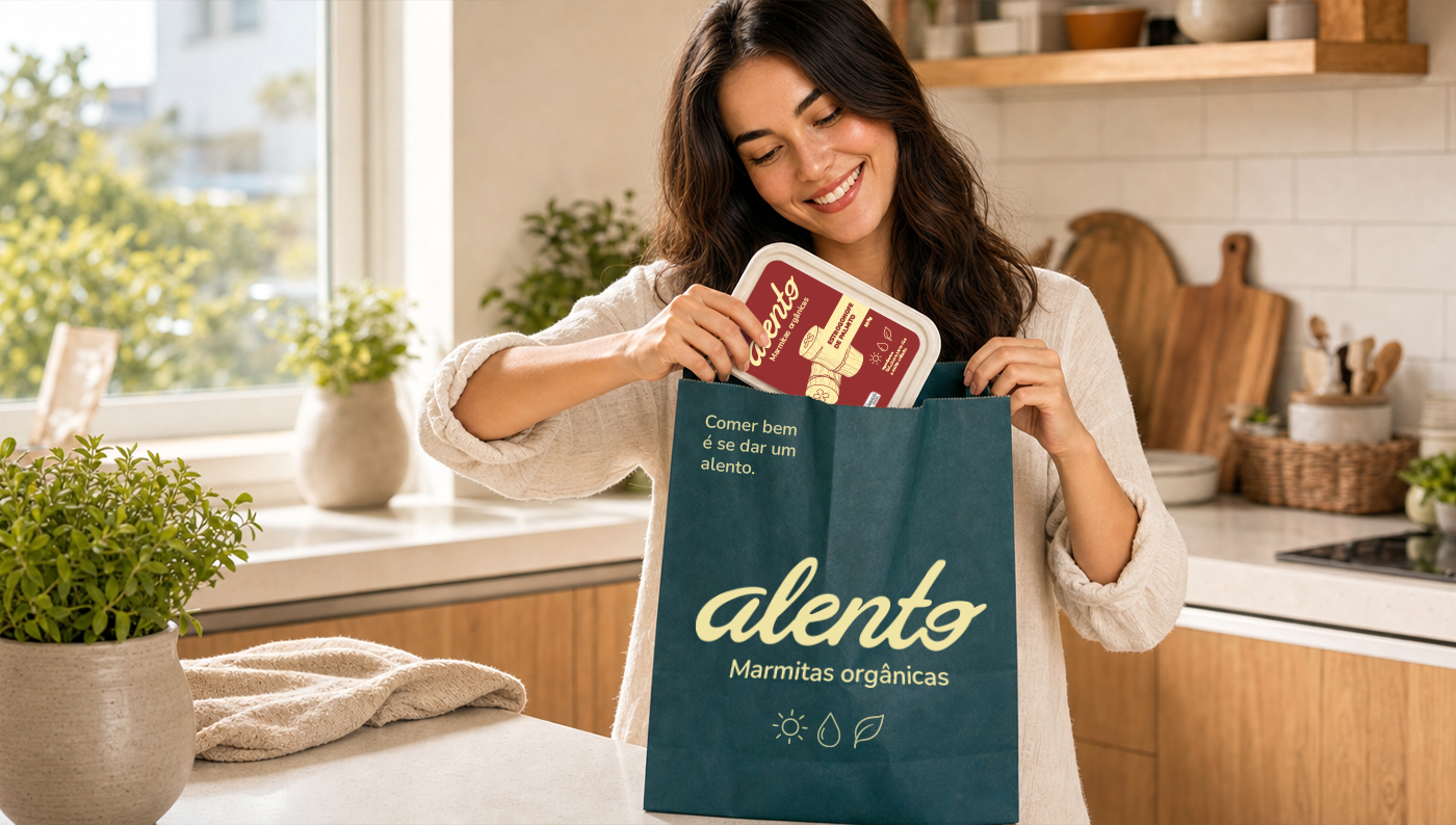
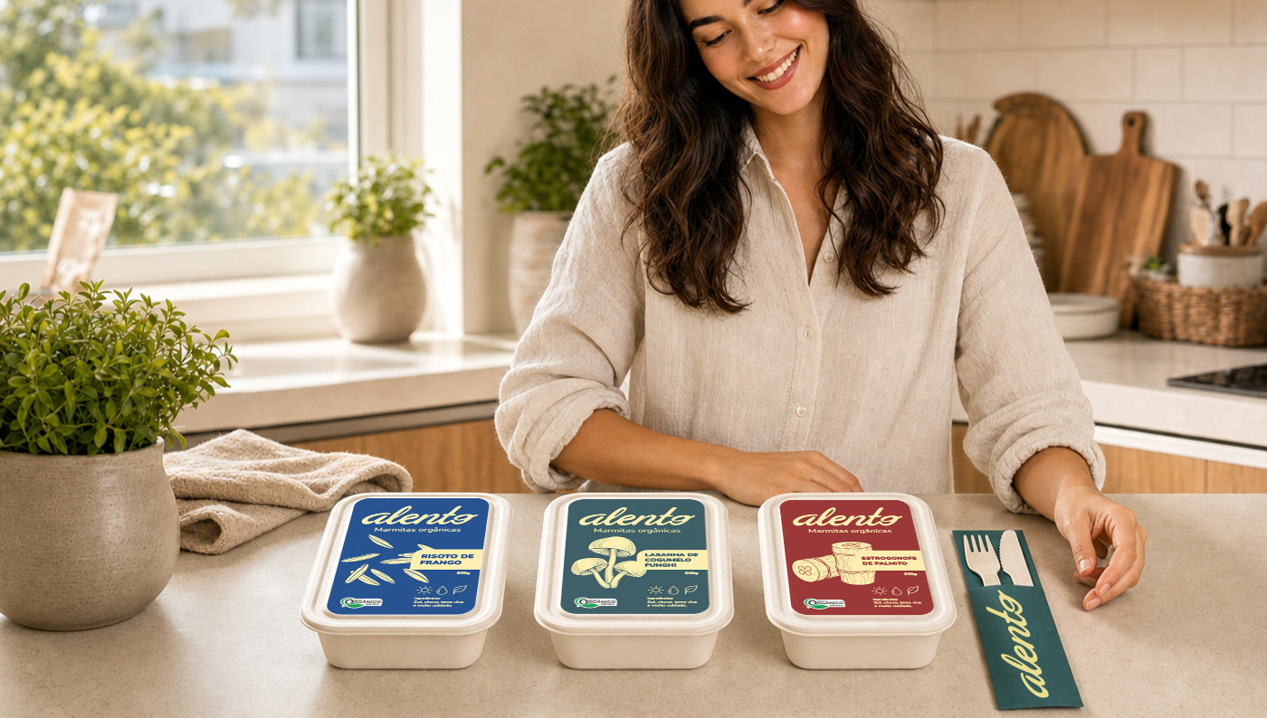
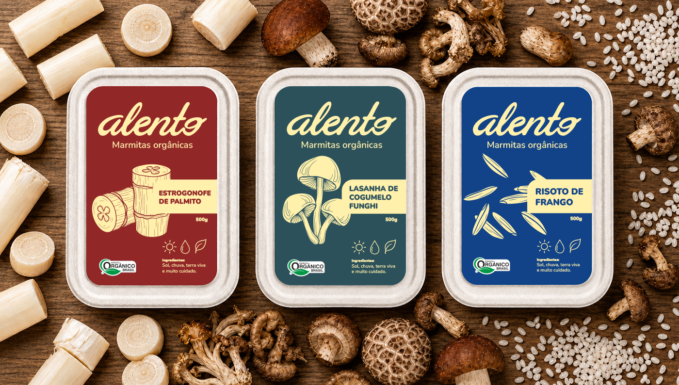
Quando começamos a desenhar o projeto da Alento, percebemos um padrão curioso no mercado de orgânicos: tudo parecia igual. Prateleiras dominadas por tons de verde, papel kraft e uma estética que, embora correta, acabava se tornando invisível. O desafio era claro: como destacar uma marmita 100% orgânica em meio a esse "mar de verde" e, ao mesmo tempo, mostrar que o congelado pode ter alma?
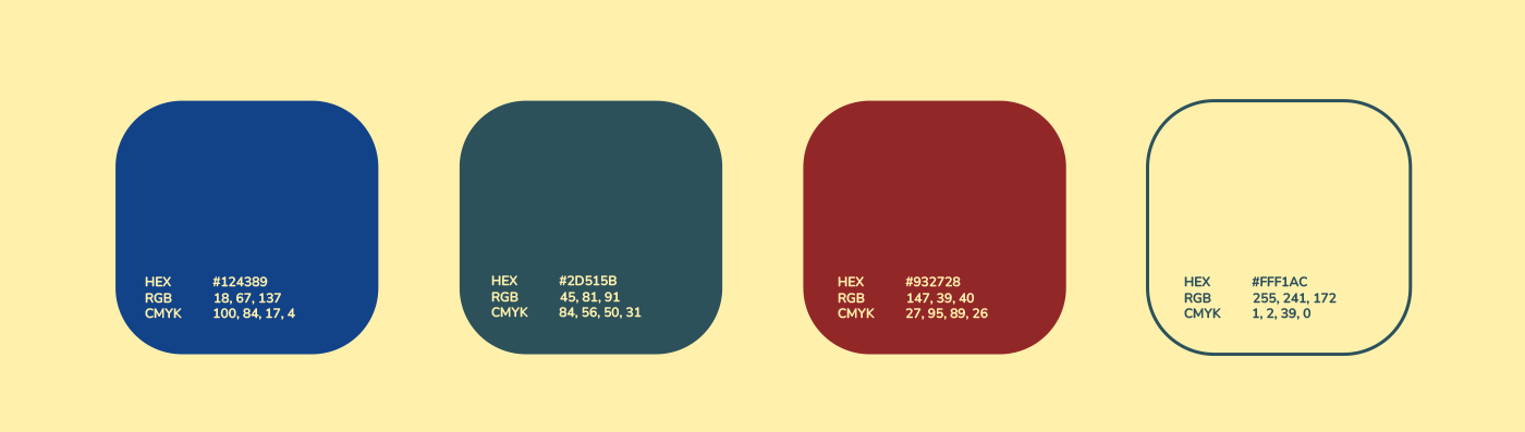
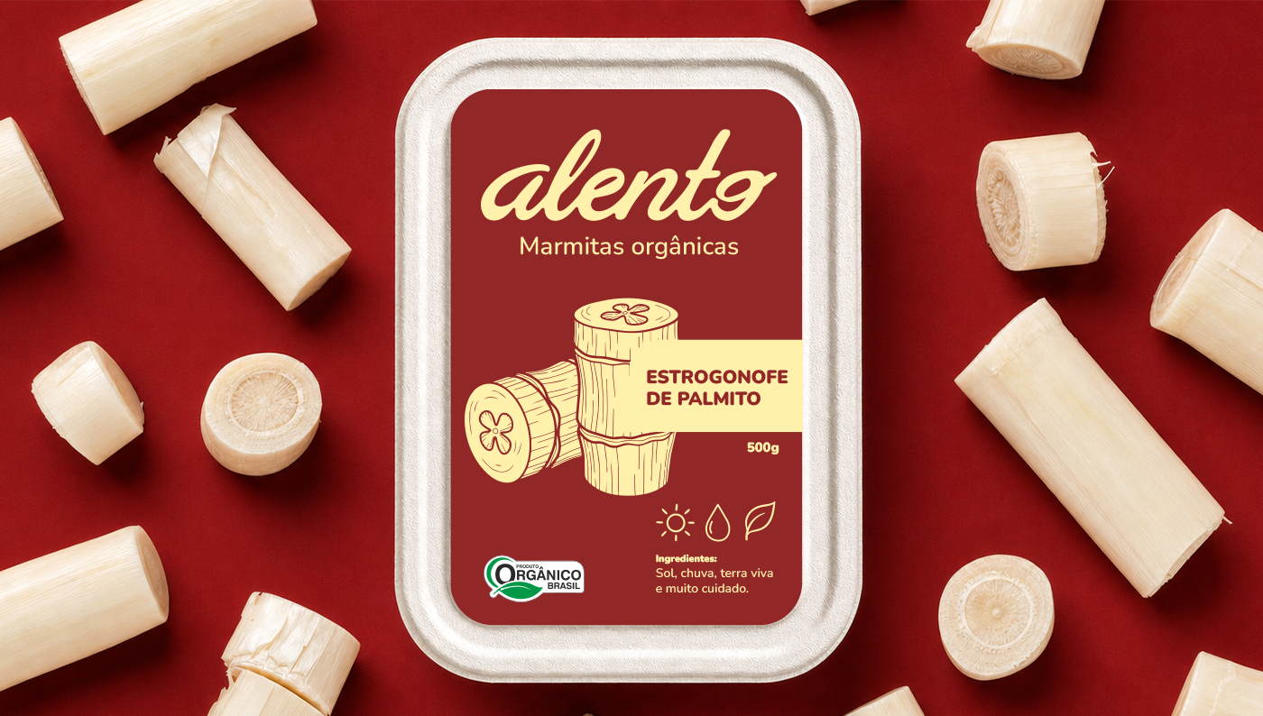
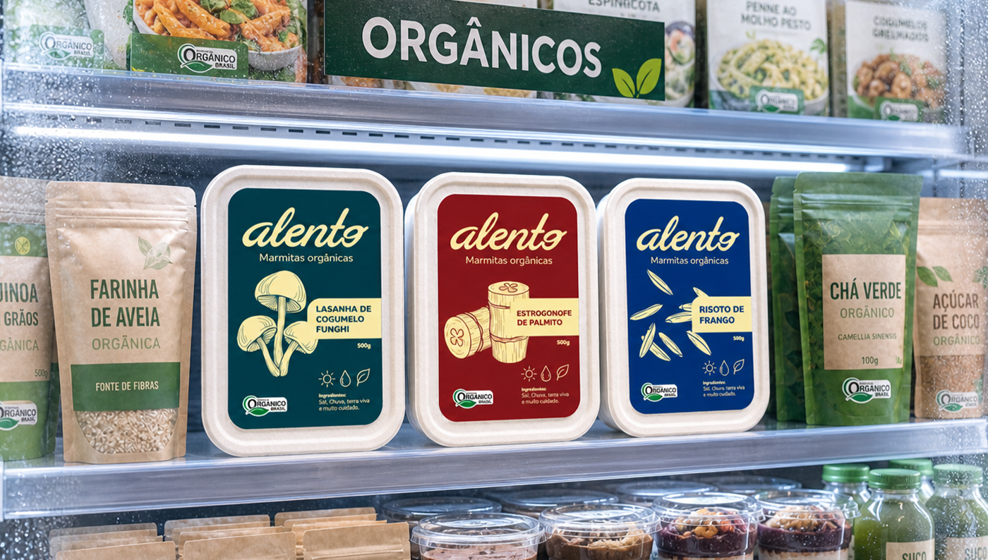
Foi desse questionamento que nasceu a identidade visual da marca. A proposta não era apenas entregar conveniência, mas transmitir o máximo respeito aos ingredientes. Para isso, fugimos do óbvio. Escolhemos uma paleta de cores vibrante e proprietária, feita para saltar aos olhos na gôndola e despertar o apetite de forma imediata, rompendo com o minimalismo frio da categoria.
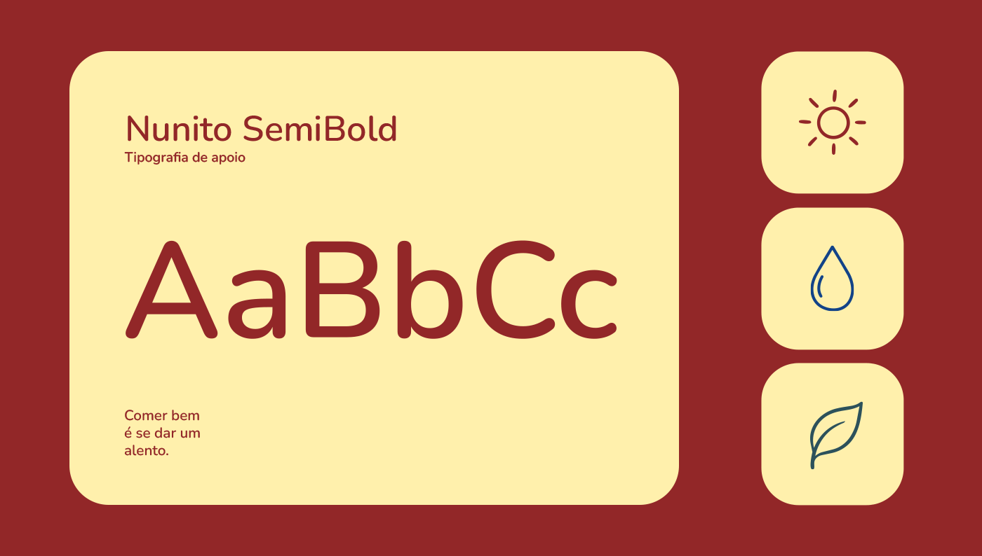
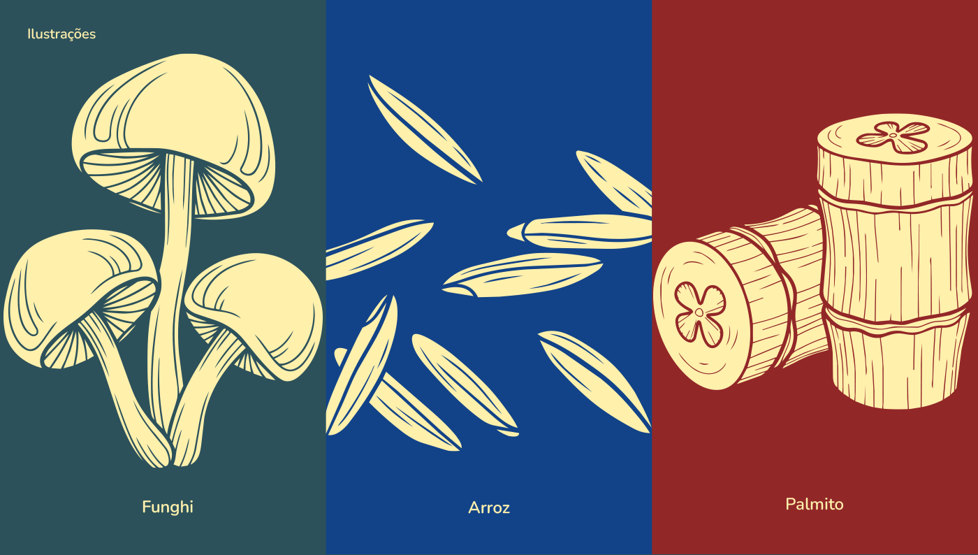
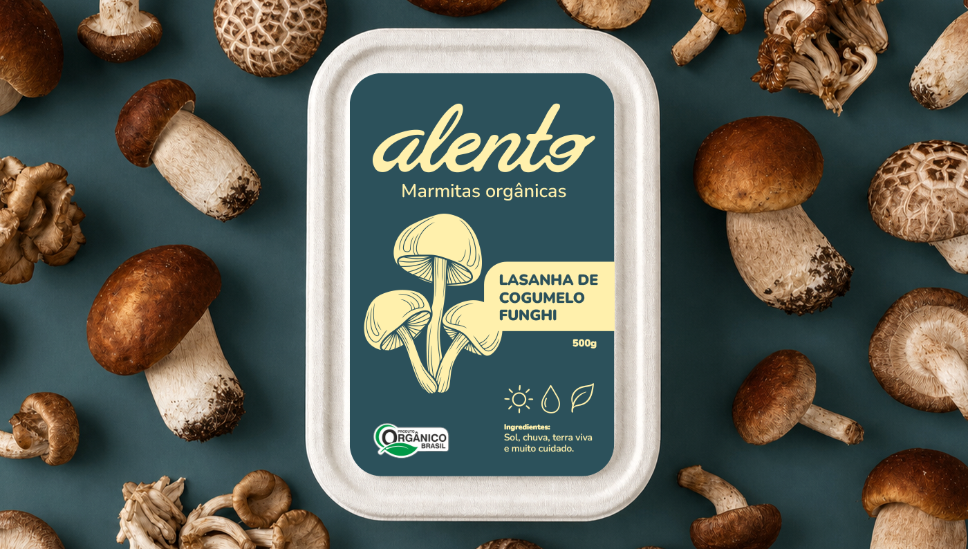
O coração do projeto está no logotipo desenhado à mão. Cada traço foi pensado para refletir o conceito de artesanalidade e cuidado. Queríamos que, ao olhar para a embalagem, o consumidor sentisse que ali existe um processo humano, com ingredientes selecionados um a um. O traço manual humaniza o produto, transformando a percepção de um "congelado industrial" em uma refeição preparada com afeto e respeito à terra.
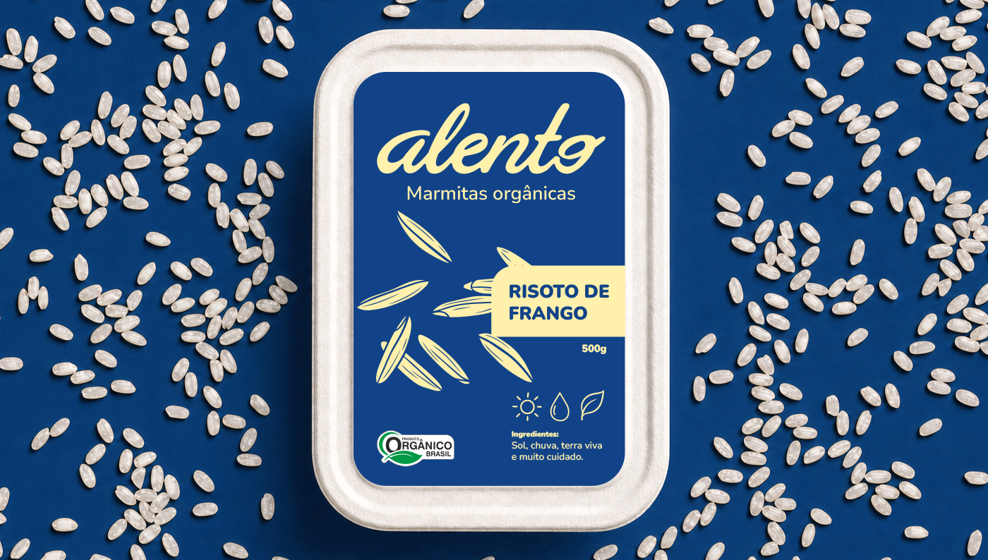
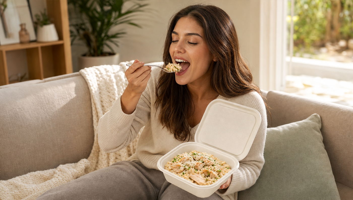
A escolha da materialidade fechou esse ciclo de forma coerente. Utilizamos embalagens de fibra moldada (bagaço de cana), que trazem uma textura tátil e orgânica. Mais do que uma solução sustentável, a embalagem é um manifesto: ela é honesta, biodegradável e tátil, reforçando que na Alento o cuidado vai do campo até o descarte final. O resultado é uma marca que não apenas se destaca, mas que convida ao toque e celebra a comida de verdade.
EN -
When we started designing the Alento project, we noticed a curious pattern in the organic market: everything looked the same. Shelves dominated by shades of green, kraft paper, and an aesthetic that, while correct, ended up becoming invisible. The challenge was clear: how to make a 100% organic meal stand out in this "sea of green" and, at the same time, show that frozen food can have a soul?
It was from this questioning that the brand's visual identity was born. The goal wasn't just to deliver convenience, but to convey the ultimate respect for the ingredients. To do that, we steered away from the obvious. We chose a vibrant, proprietary color palette designed to pop on the shelf and spark immediate appetite, breaking away from the category's cold minimalism.
The heart of the project lies in the hand-drawn logo. Every stroke was crafted to reflect the concept of craftsmanship and care. We wanted consumers to look at the packaging and feel that there’s a human process behind it, with ingredients selected one by one. This manual touch humanizes the product, shifting the perception of "industrial frozen food" into a meal prepared with affection and respect for the land.
The choice of materials closed this cycle coherently. We used molded fiber (sugarcane bagasse) packaging, which brings an organic, tactile texture. More than just a sustainable solution, the packaging is a manifesto: it’s honest, biodegradable, and tactile, reinforcing that at Alento, care goes from the field to the final disposal. The result is a brand that doesn't just stand out—it invites touch and celebrates real food.