CORVO NEGRO
Embalagem e identidade visual
Embalagem e identidade visual
PT -
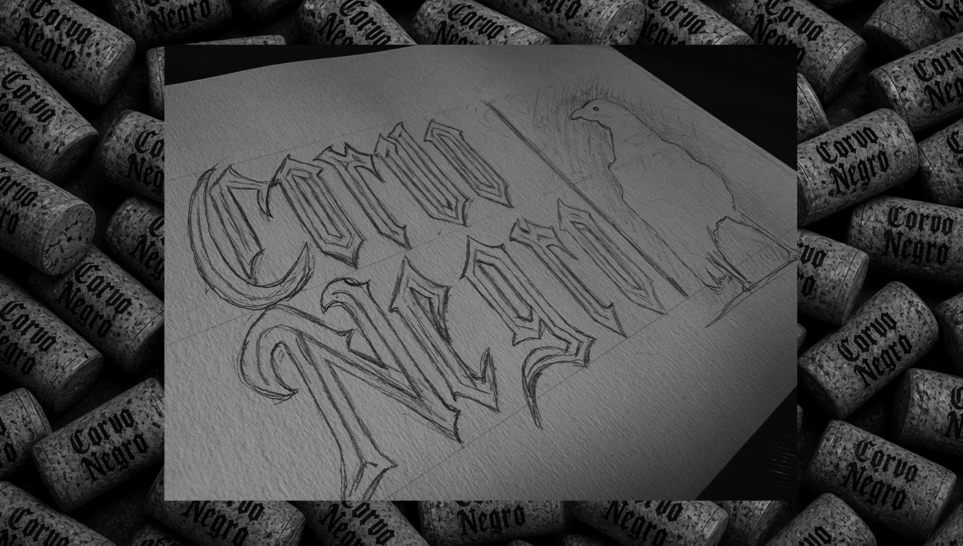
Desenvolver a identidade do vinho Corvo Negro foi um desafio que começou com uma folha em branco e a certeza de que o resultado precisava contar uma história.
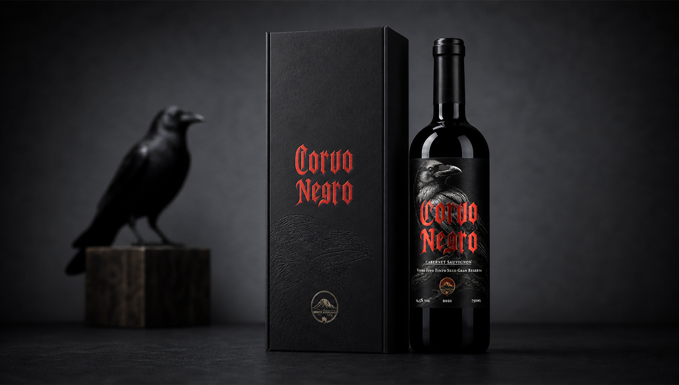
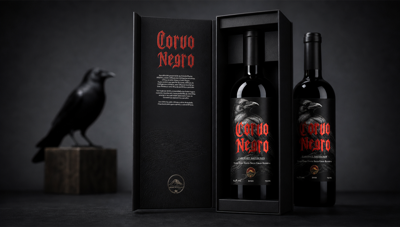
Tudo partiu do nome. O corvo é uma ave envolta em mistério e simbologia, associada à inteligência, ao enigmático e ao que há de mais profundo. Traduzir essa atmosfera para um rótulo à altura de um Gran Reserva, um vinho de guarda, estruturado e que amadurece com o tempo, foi o fio condutor de cada escolha criativa.
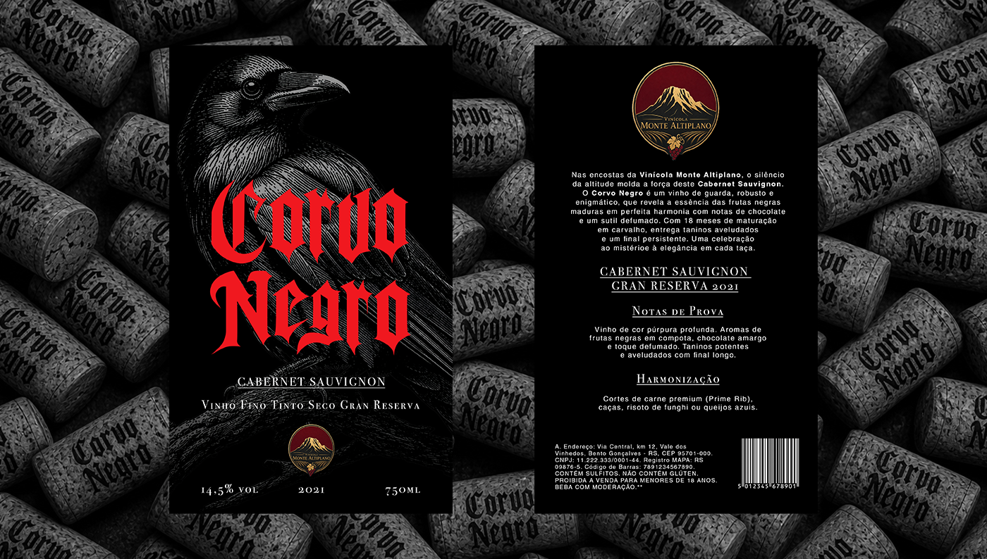
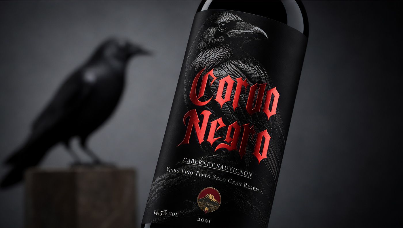
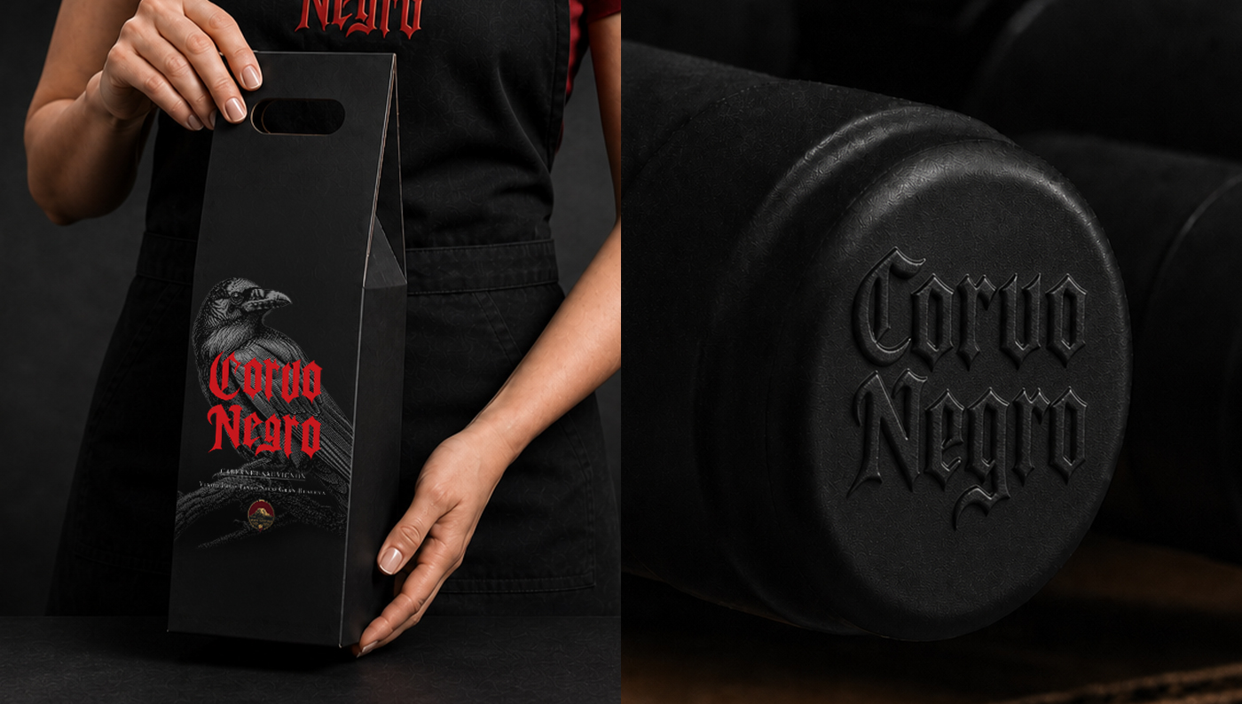
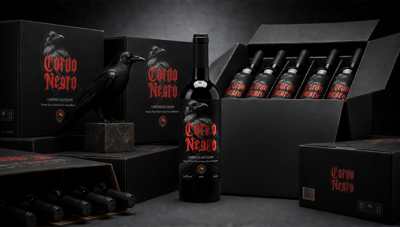
Cada decisão, da paleta de cores à tipografia, foi pensada para que o rótulo comunicasse a mesma experiência que o vinho entrega: profundidade, personalidade e um convite ao desconhecido.
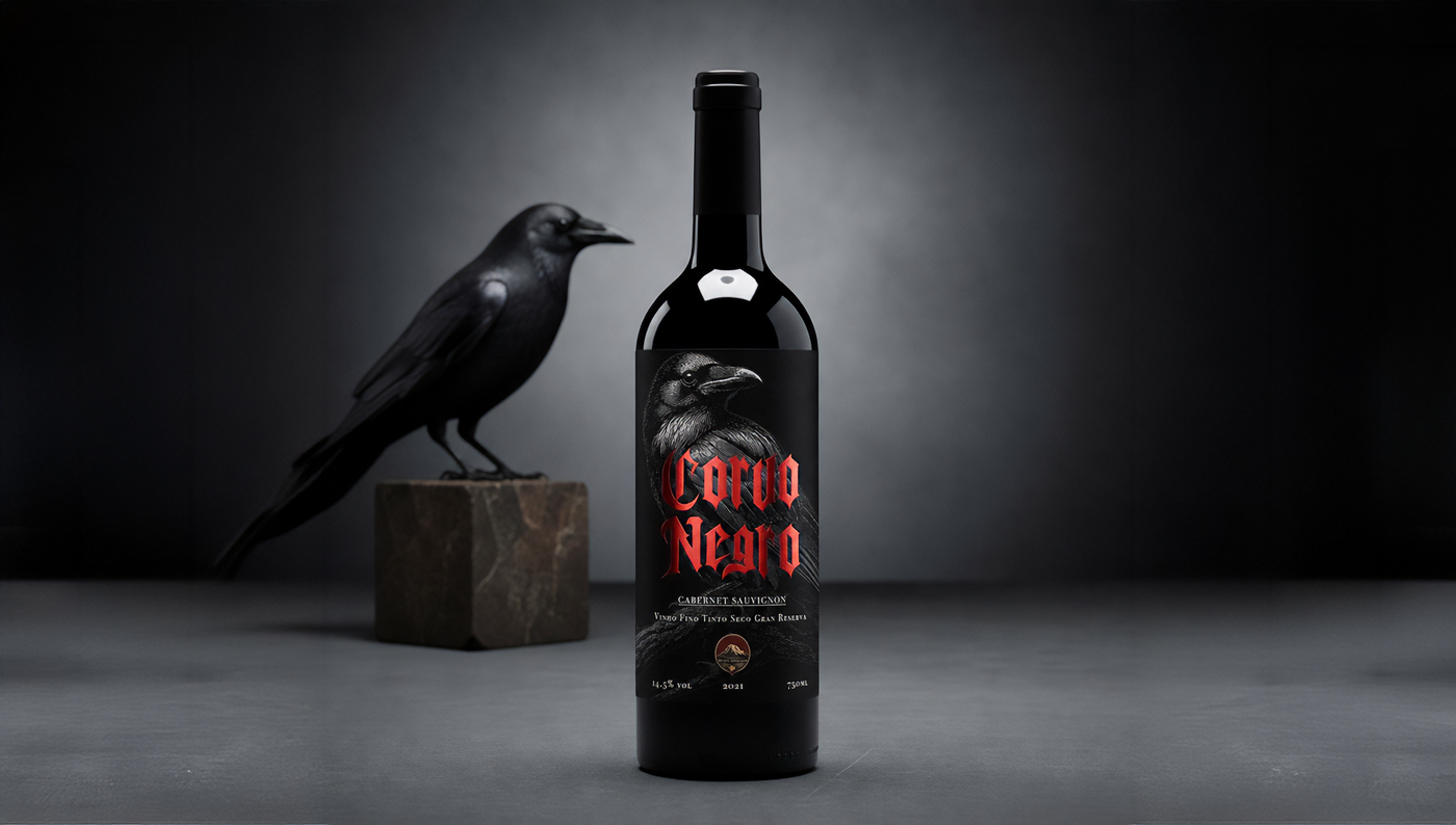
Fiquei muito satisfeito com o resultado. Ver a história do Corvo Negro ganhando vida dentro de um kit de alto padrão foi a prova de que este projeto foi mais que design, foi construir uma marca do zero.
EN -
Developing the identity of Corvo Negro wine was a challenge that started with a blank page and the certainty that the result needed to tell a story.
It all began with the name. The crow is a bird shrouded in mystery and symbolism, associated with intelligence, the enigmatic, and what lies deepest. Translating that atmosphere into a label worthy of a Gran Reserva, a wine of aging, structured and refined by time, was the guiding thread behind every creative choice.
Every decision, from the color palette to the typography, was made so the label would communicate the same experience the wine delivers: depth, personality, and an invitation to the unknown.
I was very satisfied with the result. Seeing the story of Corvo Negro come to life inside a high-end kit was proof that this project was more than design, it was building a brand from scratch.