
YAMALUBE
Embalagem e identidade visual
Embalagem e identidade visual
PT -
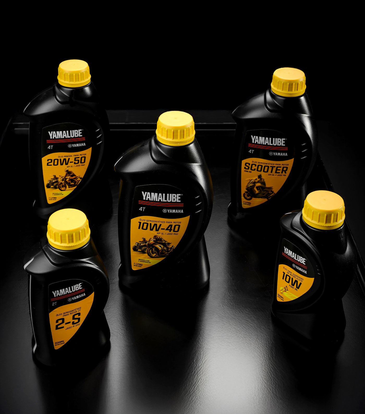
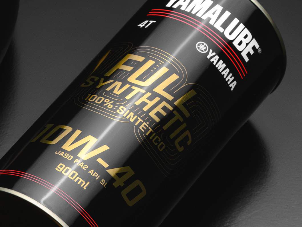
Desenvolver a nova identidade dos rótulos dos lubrificantes YAMALUBE, em parceria com a agência BRMX, foi um desafio enorme e muito gratificante, que começou com a certeza de que o produto precisava se destacar no ponto de venda.
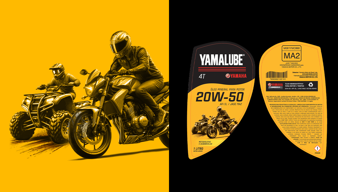
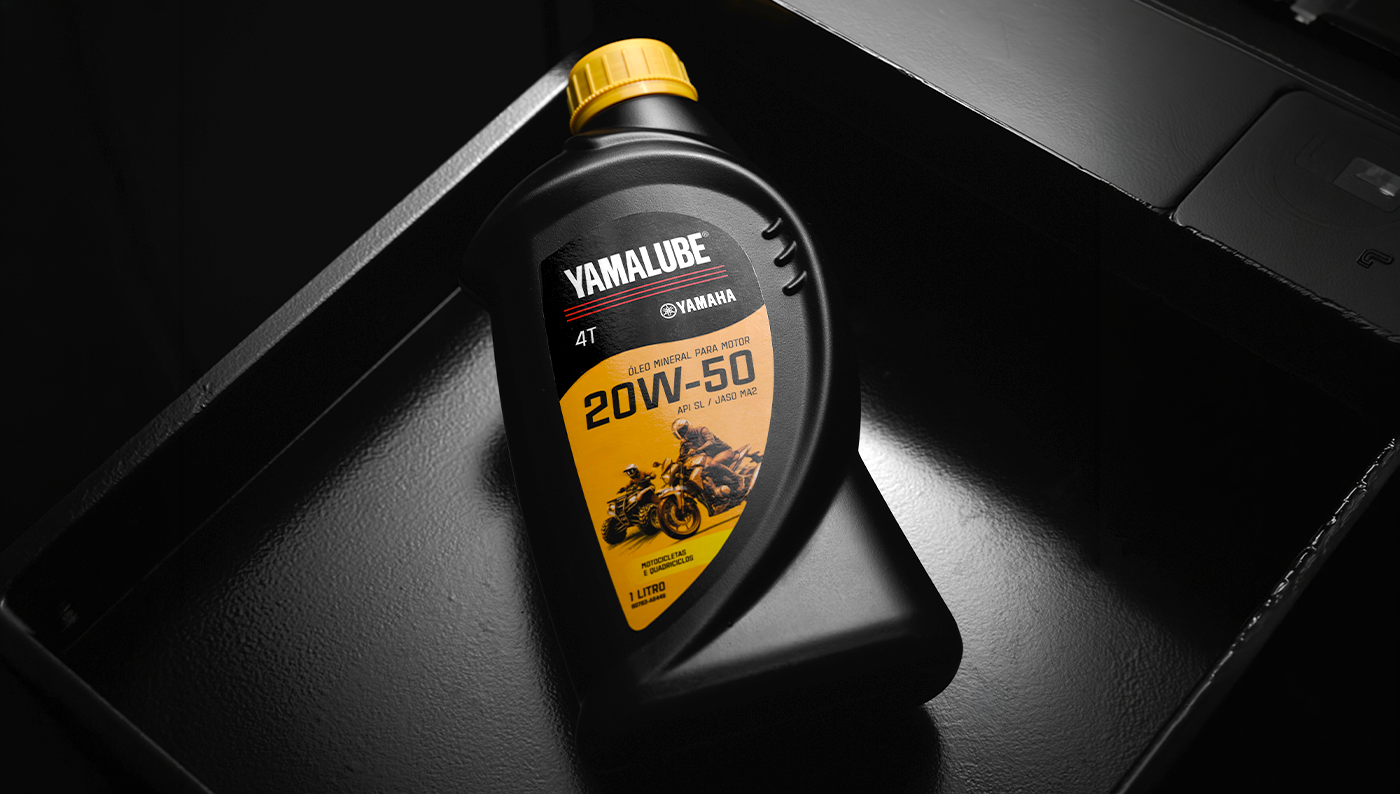
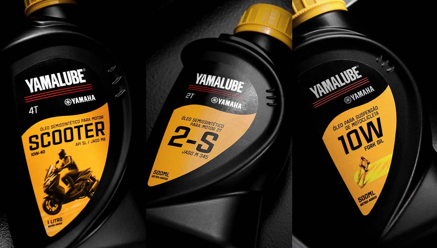
Tudo partiu do amarelo. A cor, que já fazia parte do posicionamento de comunicação da YAMALUBE há alguns anos, foi trazida para os rótulos como o fio condutor de cada escolha criativa. A proposta gira em torno de uma onda que remete ao movimento do óleo, dividindo as informações do produto e dando destaque ao nome e aos demais elementos.
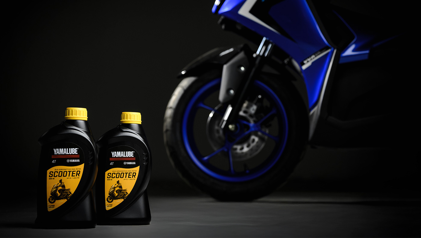
Cada decisão, da paleta à organização das informações, foi pensada para que o rótulo comunicasse a mesma energia que o produto entrega: movimento, presença e identidade forte na prateleira.
Fiquei muito satisfeito com o resultado. Ver o produto ganhando destaque no ponto de venda e se diferenciando diante dos concorrentes foi a prova de que este projeto foi mais que design, foi reforçar a força de uma marca.
EN -
Developing the new identity of the YAMALUBE lubricant labels, in partnership with the BRMX agency, was a huge and very rewarding challenge, which started with the certainty that the product needed to stand out at the point of sale.
It all began with the yellow. The color, which had already been part of YAMALUBE's communication positioning for some years, was brought to the labels as the guiding thread behind every creative choice. The proposal revolves around a wave that evokes the movement of the oil, dividing the product information and highlighting the name and the other elements.
Every decision, from the palette to the organization of the information, was made so the label would communicate the same energy the product delivers: movement, presence, and a strong identity on the shelf.
I was very satisfied with the result. Seeing the product stand out at the point of sale and differentiate itself from its competitors was proof that this project was more than design, it was reinforcing the strength of a brand.